BeePlus: The Teacher HiveMind
A Case Study in User Experience Design by Gloria Adams
In December of 2020, I took an immersive User Experience Bootcamp at General Assembly. Over the course of a week I learned the fundamentals of User Experience Design; how to use programs such as Miro, Sketch, and Figma; and created my first UX Design project: BeePlus.
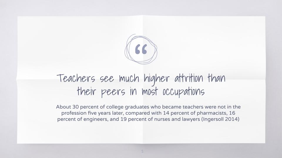
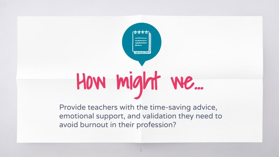
As a classroom teacher for 9 years, I knew I wanted my user to be teachers. This often underserved demographic makes up 3.6 Million users in the United States alone, but most of the software or websites that target teachers as their clients are actually providing resources designed for their students, not for their own benefit. Numerous articles are written every year about the crisis of teacher burnout and attrition; I wanted to envision a product that considered the needs of these professionals and delivered a product that would benefit the user (teachers), in turn supporting the needs of their students, parents, and administrators.
For this reason, teachers were a perfect target for a User Experience Design case study: their needs are specific, actionable, and timely. They constitute an easily defined but sizable user group, and they were accessible to speak about their needs. Overall, the experience of listening to and designing for teachers was exciting for me, having been a teacher myself for so long.
Curiosity & Empathy
Despite my years of experience as a classroom teacher, it was still very important that I conduct research into what teachers need and want before designing my website.
I began with researching the issue: I read studies of the workforce and why teachers leave the field. I looked at data gathered over the last 10 years and used it to form questions I would ask in my User Interviews.
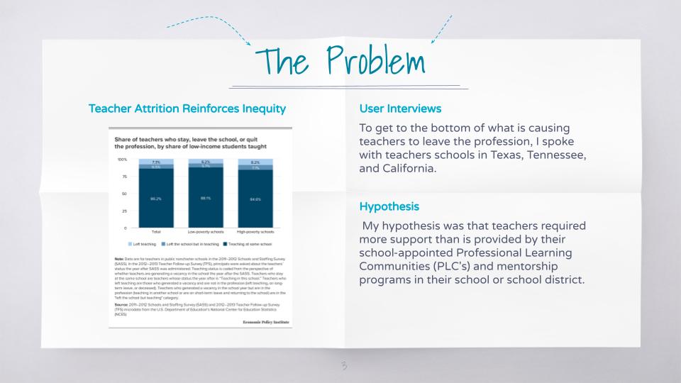


I conducted one-on-one interviews with teachers of all levels (High School, Middle School, and Primary), from Texas, Tennessee, and California, each at different schools and with a different levels of experience. I spoke to teachers who work both in general and special education to understand what issues teachers of all backgrounds were facing, rather than only at the schools where I had taught.
I also performed a competitive analysis, looking at other blogs, websites, and social groups for teachers, trying to understand how the industry was already attempting to address the growing issue of teacher attrition and job dissatisfaction.
Plots & Blueprints
Once I had conducted my research, it was time to begin analyzing what I had learned from my research. This impacted the scope and the prioritization for BeePlus. I learned that some of my assumptions about what causes teacher dissatisfaction and stress were biased by my personal experiences, underscoring the important lesson from my instructor at General Assembly: You are Not the User.

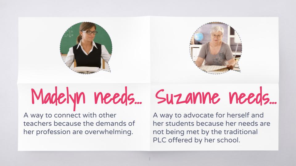
I analyzed the user findings using an Affinity Map, and gathered my insights into trends. From this process, I had a much better idea of what my user was actually looking for, what they might use a product like BeePlus to achieve, and how to make the product fit their needs.
For example, while I had originally conceived of designing a mobile app, I got feedback that for many teachers at work, their phone service is blocked on the school wifi- they needed to be able to access our service from their computers. So we pivoted to designing a website, because that’s what the user needed.
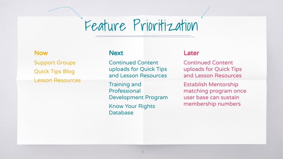
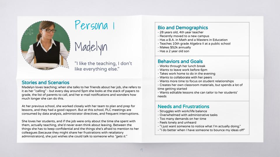
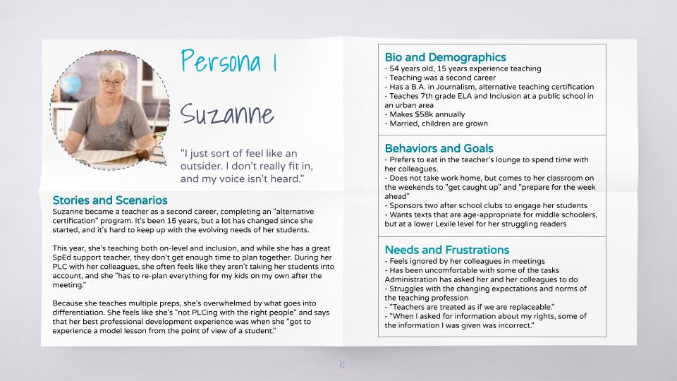
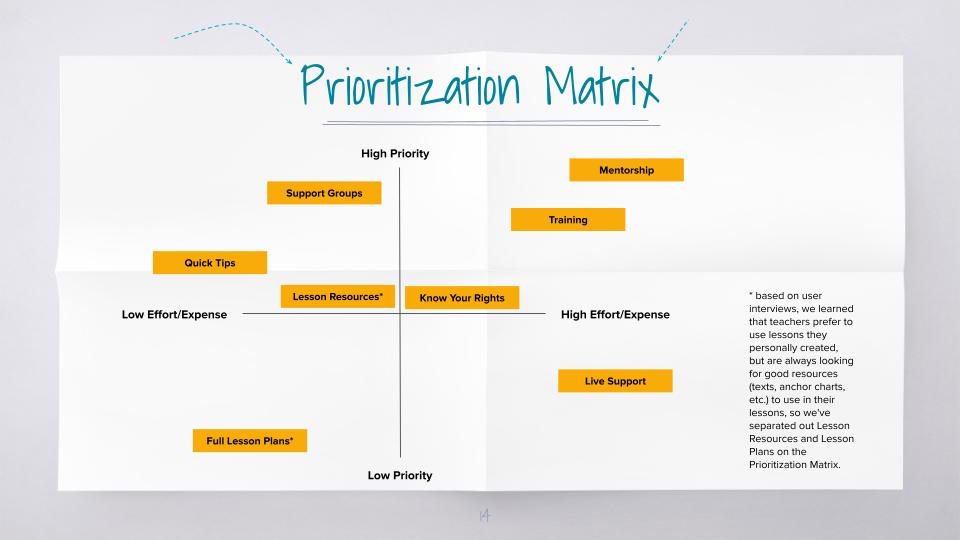
I constructed User Personas to guide my design moving forward, using the insights and direct quotes from my interviews. These personas were invaluable in the Prioritization process, because it called upon me to focus not on what features I most wanted to spend time creating, but what features my users were most likely to use, what features would meet the gaps I discovered in my competitive analysis, and what features I needed to include in my “Minimum Viable Product” for launch.
Composition & Creation
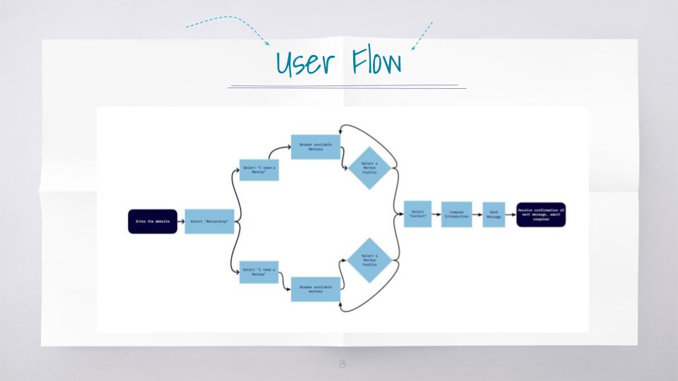
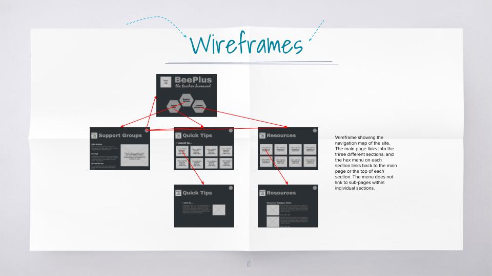
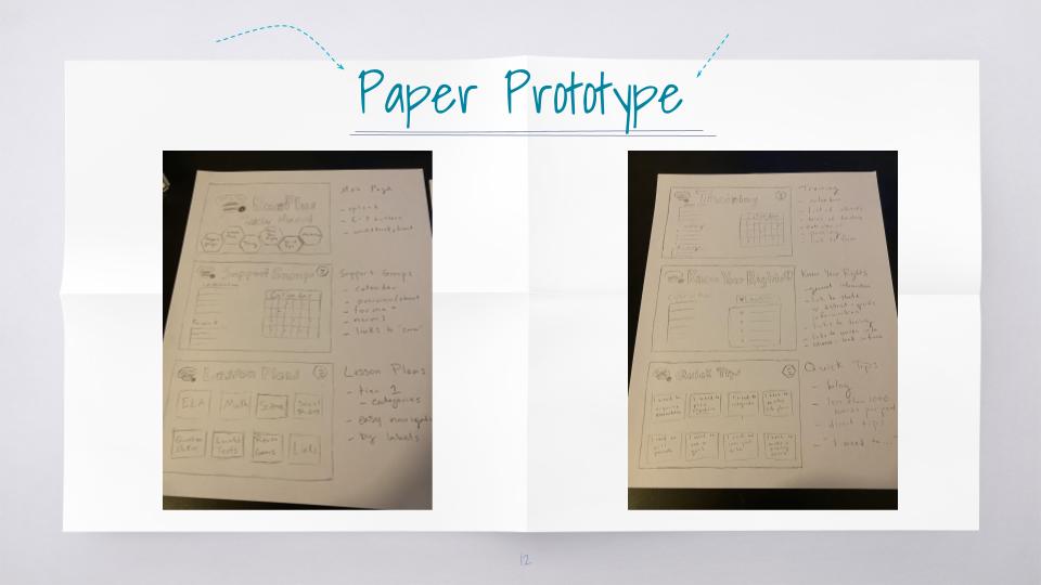
Finally, we were ready to start designing. Using everything I had learned, ideated, and decided in my previous work, I began with sketching out on paper what the basic website would be. I built out a sitemap and planned how features would be organized, nested, and navigated on the site.
From this rough sketch I began to build wireframes, making sure to include the locations of any icons, links, graphics, and text positions.
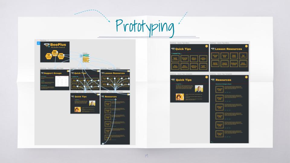
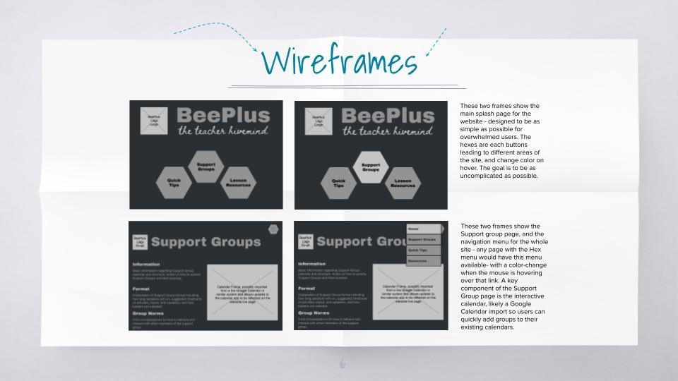
Once I had my wireframes designed, I began to think about typefaces, color schemes, and icons. This part of the design process is the most tedious, but also the most fun- making very subtle changes and working to make sure the overall effect is easy to use and appealing.
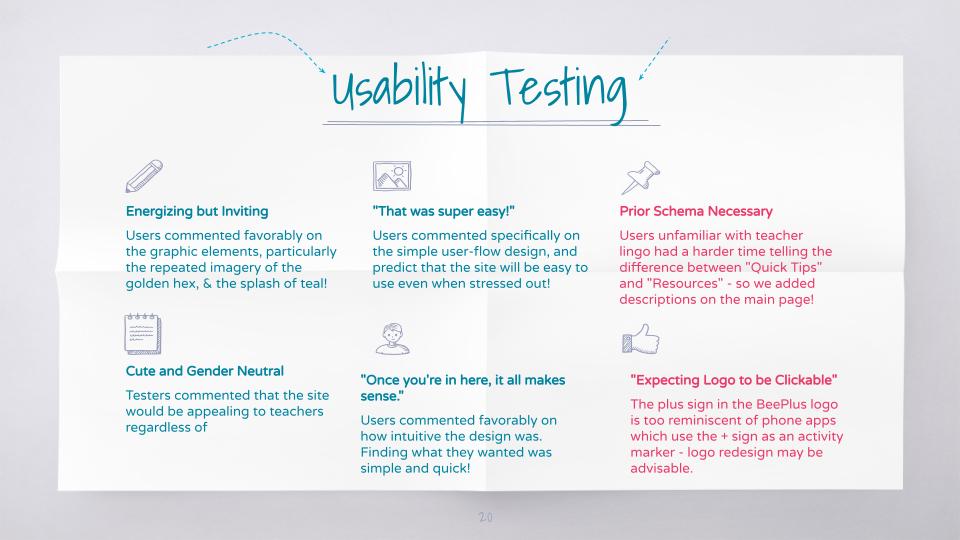
Finally, I had a working prototype that could be clicked through, and completed a first round of Usability Testing. I got some very good feedback from my first test, and made several changes before giving my final presentation on BeePlus. The site is now designed and ready to be developed!
